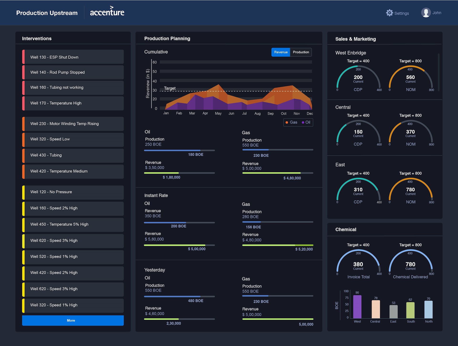

Dashboard Design – Oil & Gas Plant
My Role
UX Design
Client Engagement
Visual Design Collaboration
How might we redesign the dashboard for a Field Supervisor at an Oil & Gas plant, with a focus on improving readability and make it more action oriented?
Project
Goals
- 1. To redesign the dashboard to be more easily scannable with appropriate information hierarchy
- 2. To design the dashboard for analysis & interpretation, not consumption of data
- 3. Apply Gestalt's laws, effective use of colour & visualisation and a minimalist approach to reduce complexity on the screen
The client wanted to redesign the existing dashboard, primarily used by the Field Supervisor at their Oil & Gas plants. Some of the issues in the existing dashboard design were regarding information overload, lack of use of visualisations and the inability of the information on the screen in helping the primary user to make interpretations and thereby delaying decision making. This badly affected the Field Supervisor’s ability to do their job efficiently, especially in supervising & error handling of wells, pumps & other production facilities.
Skills
Used
Stakeholder Interviews | Information Hierarchy | Task Flows
Mockups | Wireframing
Through continual collaboration with the clients, we mapped out the primary objectives and goals that the dashboard needs to achieve and understand how it should be helping the field supervisors. The primary insight that was drawn from these conversations with the stakeholders, was that the primary user is an expert user of the information and data sets that are represented on the screen. Therefore, the data should be presented in a way that a step ahead of just being listed down for consumption; instead be presented in a way that can be interpreted and analysed easily and thereby help the decision making for the field supervisor.
We used clear & indicative visuals that are easy to interpret and improve the scanability of the dashboard wherever possible. The appropriate use of colours was extremely important and a major missed opportunity on in the older version of the dashboard. We also took into account the outdoor and on the move nature of a field supervisors' job and designed the dashboard to have a dark background to improve contrast & visibility. The dark background also effectively complemented the colour palette used on the screen.

Project
Impact
- 1. Empowered the dashboard to have a direct impact and help the field supervisor in their daily responsibilities
- 2. Allowed the field supervisors to perform their job with greater efficiency and better decision making
Learnings
Expert users need a different approach: In a project like this, where the set of tasks are limited and pre defined with little to no variation and the user is an expert at the information they are looking at, the design of each screen needs to be approached differently than a typical UX project, with the constant awareness that the screens need to build on the existing knowledge of the users and help them in better decision making.